Visual identity for new banking service Pocopay
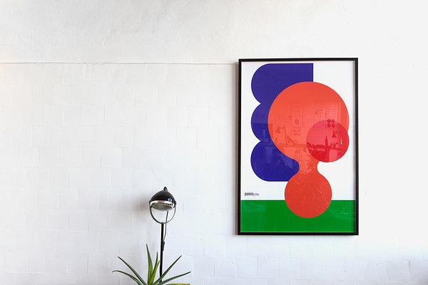
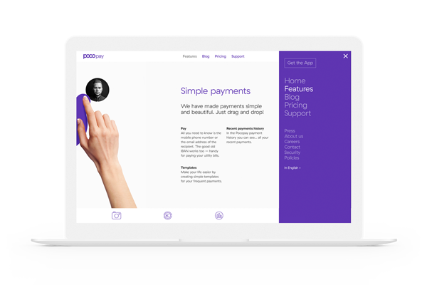
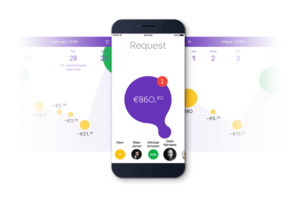
Pocopay is a revolution in everyday banking. Built on a brand new infrastructure, it enables people to send and receive money in an instant. Besides a ton of other cool features, it is the intuitive fluid-based user experience that makes Pocopay really stand out. AKU has worked on the project from a very early stage, consulting on the product, branding and communication. They have also created the mobile-first visual identity, website and app elements.
Responding to the constantly evolving ways people access and manage their money, AKU has developed a mobile-first visual identity, website and app. The modular and aesthetically simplistic design elements draw focus to the concept’s user experience and bring calm and clarity to banking, an area commonly synonymous with overwhelming jargon.
Responding to the constantly evolving ways people access and manage their money, AKU has developed a mobile-first visual identity, website and app. The modular and aesthetically simplistic design elements draw focus to the concept’s user experience and bring calm and clarity to banking, an area commonly synonymous with overwhelming jargon.
Having integrated animation from motion design specialists Tolm and mobile UX-UI from Mobi Lab, AKU’s work for Pocopay is an example of how a considered and comprehensive approach to design for banking and finance, an area that so often sees products developed from an archaic perspective, can transform the efficiency of our everyday tasks.
Client: Pocopay
Design: AKU
Animation: Tolm
Mobile UX-UI: Mobi Lab


