Anton Koovit’s UCity Pro is a typeface for the future, found in 1970 Lancia Stratos Zero
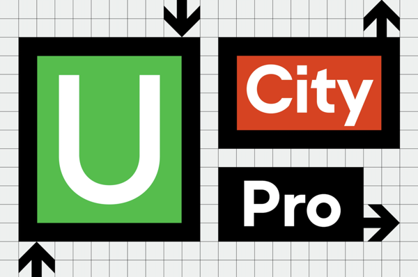
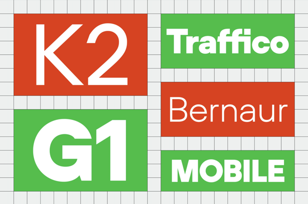
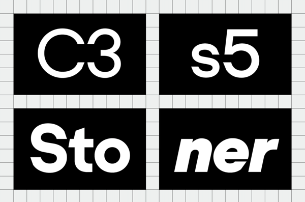
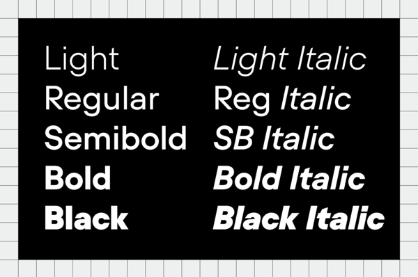
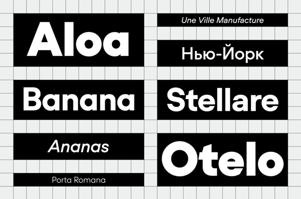
Published by Fatype Type Foundry, of which Anton is one half of alongside Swiss type designer Yassin Baggar, UCity Pro interrogates the modern significance of geometric typefaces in relation to its predecessors.
Following Anton Koovit’s U8 typeface, the Estonian type designer has released UCity Pro, a spiritual sequel and similarly striking geometric sans-serif; a genre described by Anton as “the most radical typeface genre from the 20th Century.” Taking a fresh perspective, and challenging its heritage in the process, Anton explains how UCity Pro “is a new take on this classic genre,” adding, “one made again for the future, but from current perspectives.”
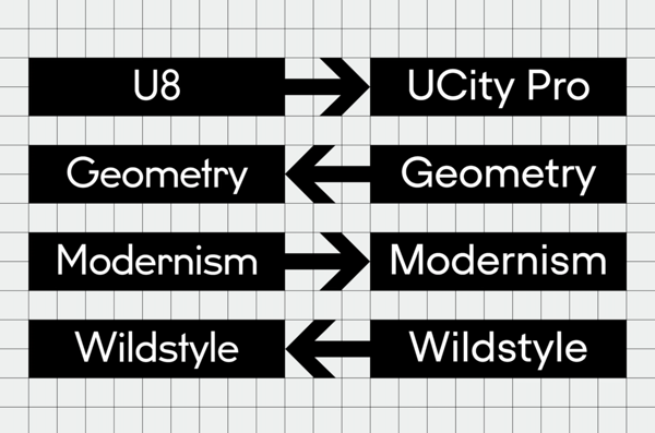
Following U8’s historical influence of 1920’s Berlin Underground signs, UCity Pro takes on the task of designing the typeface of today, taking inspiration from the past’s predictions of the future. “The early idea probably stems from the time when I was working on U8,” Anton recalls. “I started wondering if I could complement the typeface with a different character,” playing around with the concept for a considerable amount of time. “One day in 2017 I bumped into some pictures of the Lancia Stratos Zero,” Anton explains, a unique concept car designed by the famous designer Marcelo Gandini, interestingly revealed in the same year that Herb Lubalin and Tom Carnase released their ITC Avant Garde. “Somehow, with a few tense lines and abrupt angles, this futuristic car design from 1970 seemed to me like a good extrapolation of modernist principles,” he adds, principles that he then sought to further explore.
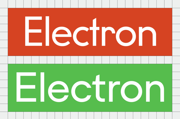
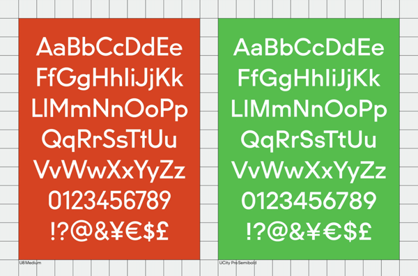
The son of a racing driver, the inspiration was seemingly in his blood. Infatuated by the stark, severe angles of the car’s form, Anton implemented them into UCity Pro’s structure – replacing the familiar curvature and warmth of typical geometric sans serifs. “I looked at how Marcelo Gandini treated a car. You have two wheels, and just very simple panels with minimalistic details for accentuation,” he explains. “I took the typeface’s main rounds and verticals, outlined the grid, and started modelling what is in between,” he recalls, in doing so crafting a system that produced exciting, unexpected expressions of form. “I like that the majority of horizontal terminals align,” Anton notes, creating interesting counter shapes and non-traditional letterform combinations. “Perhaps the bold Ampersand is one of my favourites,” he adds.
With the concept of making a typeface of the future, UCity’s subsequent construction is one refined for the 21st Century; for example utilising the strict principles of geometric sans serifs to produce “a more sped up tempo, a reduced style, and a certain efficiency.” Going one step beyond the typeface’s aesthetic, its technical implementations are also designed with the future in mind. Supporting Cyrillic and OpenType features within a single variable font file, the low-energy production of UCity Pro culminates in a tiny file with minimal data storage – appropriate for a low-waste world, and handy for any environmentally-focused designer.
“It was awesome that along the project,” Anton tells us, noting how rewarding he found the process of making UCity Pro, “I could lay aside some of my favourites shapes from early modernism.” He points to the brutally simple “crucifix ‘t’” in U8 as an example of how he explored “different shapes and their resulting effect.” Anton along with Yassin then decided to link UCity Pro with U8 with their unifying “U” due to their shared classification, concluding, however, how they “evoke very different feelings.”
Photos: Anton Koovit / UCity Pro (Copyright © Anton Koovit, Fatype, 2020)
Original article was published: www.itsnicethat.com
